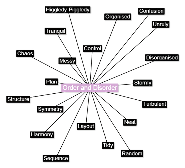
O R D E R & D I S O R D E R
S E R P E N T I N E G A L L E R Y
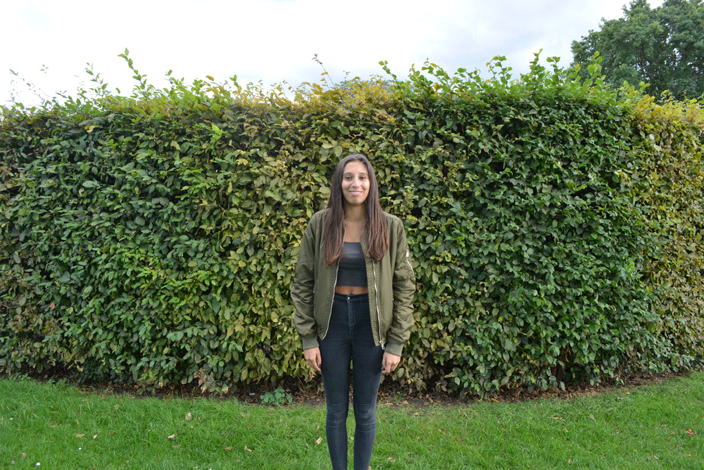
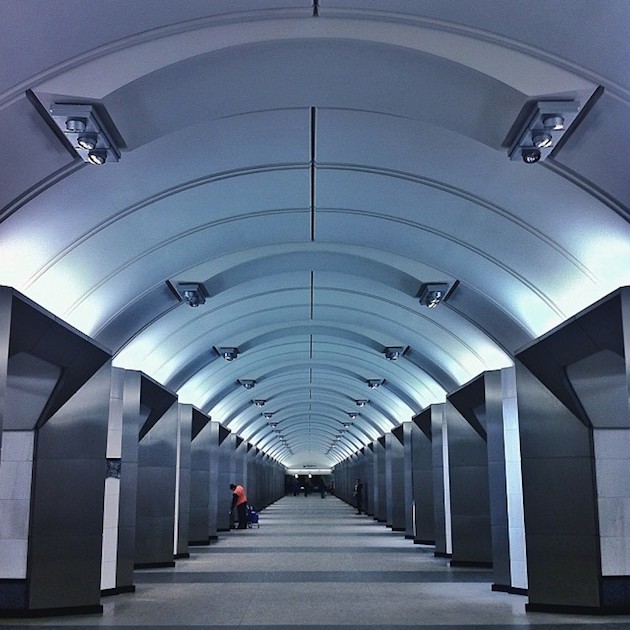
In the summer holiday I went to the serpentine gallery in hyde park and took pictures of the Pavilion which was designed by Selgascano. I decided to photograph this Pavilion because the colours were very interesting and bright and intriguing to the visitors. I also took pictures of another exhibition by Lynette Yiadom-Boakye.


O R D E R
The pictures below show order. They show similar ongoing patterns, shapes and colours which make them look neat and simple. Some of the photos were taken in the school environment and some were taken out of school.


D I S O R D E R
The photos below show disorder. They contrast the images above as they are untidy and messy. They show stains and rubbish as well as disorganised working spaces.


O R D E R & D I S O R D E R
The images below show ordered pictures and disordered pictures compared to each other. The aim of this was to show the significance of the contrast between images of tidied spaces and objects and messy, disorganized spaces/objects.


P O R T R A I T D I S O R D E R
The aim for this task called portrait disorder is to create a series of portraits. I had to take a series of images of someone doing something and put them together on photoshop. This created a gif.
Artist Analysis: Romain Laurent

Romain Laurent is a photographer and director. He is french but now lives in New York. He studied product design at the National School of Applied Arts in Paris and then discovered photography. He has been working in advertising and on personal projects like gifs.
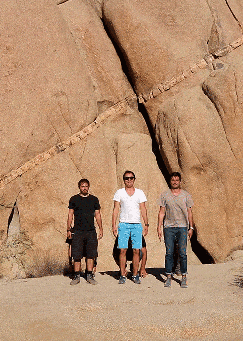
This is a gif my Romain Laurent. It is a gif of three men standing in front of another three men. The first row of men are crouching down while the men behind are standing up. They swap continuously which creates a smooth transition. between the rows. The background that they are standing against is a brown, rocky cliff. It is very effective because it is plain and still which is attracts more attention to the main focus which is the men.
|
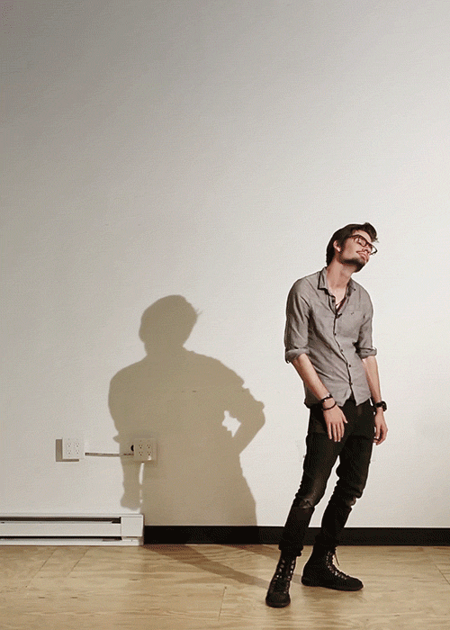
This gif is intriguing and interesting because it is of a man standing still while his shadow is moving. This is different than most gifs, as the main focus which is the man, is not moving. The artist has changed the focal point to the shadow instead. The man is in a different position than the shadow. He is standing up, slouching while the shadow is frantically running continuously. The location the picture is taken in is very casual which ads to the intriguing atmosphere as the shadow is very unusual compared to the man and the background.
|
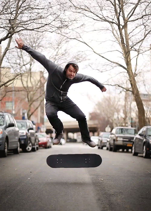
This is a very light hearted gif as it has a humorous tone to it. The gif is of a man in the air in the middle of doing a skateboarding trick. Just like the other gif only parts of the gif are moving. The body of the man is standing still while his head is bobbing and his skateboard is spinning. He is in the middle of an empty street. This gif suggests time standing still which intrigues people.
|
How to Make a Gif
First you open photoshop and click on 'file', 'scripts' and 'load files into stack'. After you have chosen your images press 'ok' and this will open up the images you selected. Once you have the images click 'window' and 'animation' and this will open up a side bar that allows you to then made frames from layers. This creates the gif. You then change how quickly the images move from one to the other by clicking the bottom right corner. You then click on 'file' and 'save for web & devices' in order to save it as a gif.


First Response
The images below were taken against a green, leafy background in a park in camden. A problem with the gifs below is that I did not use a tripod when taking the pictures which affected the quality of my gifs. I improved this for my second response.
|
|
Second Response
This is my second response for portrait disorder. The way in which I improved my previous gifs is by using a tripod. This improved the quality of my gif as it prevented me from moving the camera therefore the images were taken from the exact angle and point of view making the gif flow easier. Another way I think these gifs are better than my first ones is that they are more creative whereas the other ones were just of someone turning and moving their arms these ones are more interesting and fun.
|
|
Third Response

The artist and me
In this section I compare my work with the work of the artist that I analysed. I chose to remake the gif of the girl blowing a bubble. I made the gifs on photoshop using the animation feature. I took the images for the gif outside from a low angle to make it look more similar to the one the artist made. The images I took for this gif are bellow.
Gif by Romain Laurent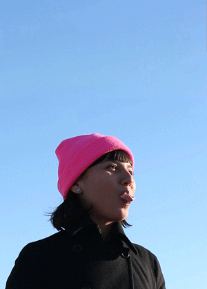
|
Gif by me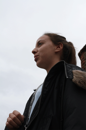
|


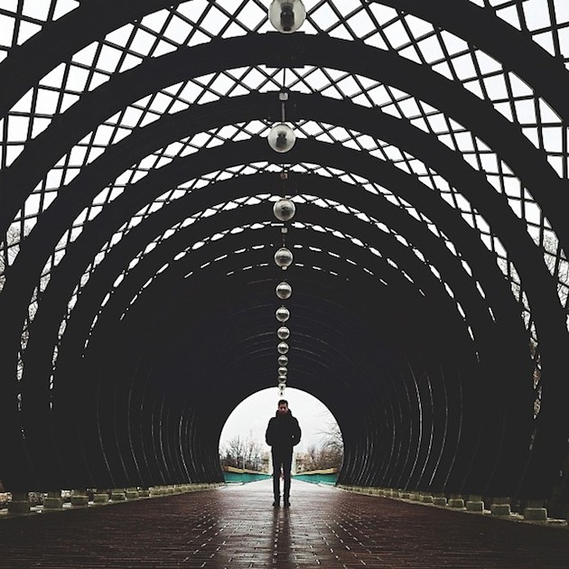
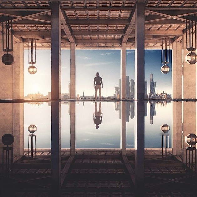
S Y M M E T R I C A L O R D E R
Artist Analysis
|
|
|
How to Create a Symmetrical Image
I started off with the image on the top left hand corner that was taken in south bank. You first select the half of the image that you want reflected and copy and paste it. You then click 'transform' and 'flip horizontal' and that flips the image. You then have to move the image into place and crop it as you like.


The images below show symmetrical order. I created these images in Photoshop. I first took the first response pictures at school and the second response images are taken in London tube stations and in Norfolk.. I took pictures of places that look symmetrical like hallways and staircases. I then edited them on Photoshop using the transformation feature. Some of the images are reflected twice meaning that I halved the picture from left to right and then halved it again from top to bottom and some are just reflected once.
First Response


Second Response


Artist and Me
Image by Sasha Levin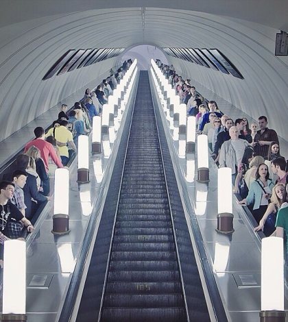
This image is of the escalators and stairs in the tube station. Sasha Levin didn't use photoshop to make this image more symmetrical because the image was already symmetrical enough. She kept the camera still and stood in the centre of the stairs so the picture was more symmetrical and neat.
|
Image by me
I took this photo of the escalators and stairs in the tube to imitate Sasha's image on the left. I used photoshop to make this image even more symmetrical because my original one had different amount of people on either side therefore didn't look very symmetrical.
|
T Y P O L O G Y
Typology is a study or analysis of different categories according to a genera style.
Typology (objects) - categories of objects or belongings according to their characteristics.
Typology (psychology) - A model representing different personalities.
Typology (urban planning and architecture) - Different categories of characteristics common to buildings or urban spaces.
Typology (objects) - categories of objects or belongings according to their characteristics.
Typology (psychology) - A model representing different personalities.
Typology (urban planning and architecture) - Different categories of characteristics common to buildings or urban spaces.
Artist Analysis: Ari Versluis and Ellie Uyttenbroek
|
|
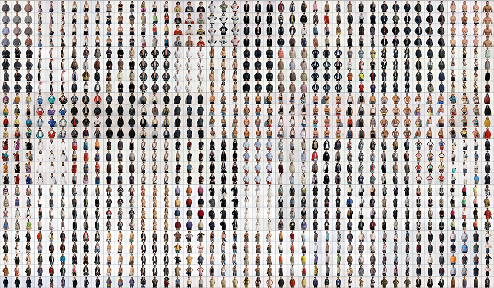
Ari Versluis who is a photographer and Ellie Uyttenbroek who is a profiler have been working together since 1994 documenting many different identities. They shared the interest of striking dress codes of various social groups and that inspired them to create a series called Exactitudes which is a contraction of exact and attitude. In their series they photograph people wearing similar outfits and label them as a specific group of people in an attempt to express different personality types and social groups.
|
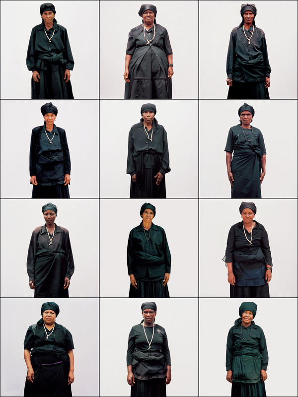
Black widows - Praia 2004The image above is a collage of 12 images of older women wearing black and facing forward. They are dressed very similarly and the images capture the sense of culture and style. Them being in the same position emphasises the similarities between them and again represents their style. The background, like in the other two images, is white to make the women the focal point of the piece. The images are taken from the same distance to again increase the similarities that can be seen.
|
Mademoiselle Prive


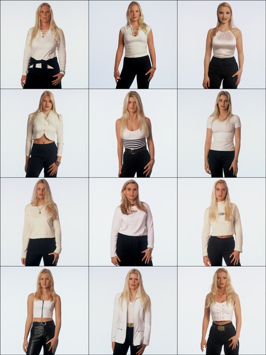
First Responce
For my first response I took images of students and teachers in the school environment with either a white or brick background.


Second Response
For my second response I took pictures of random people in Camden wearing hats and sunglasses. This shows typology as hats and sunglasses are accessories that not everyone wears therefore this shows the types of people who wear them.
Sunglasses |
Hats |


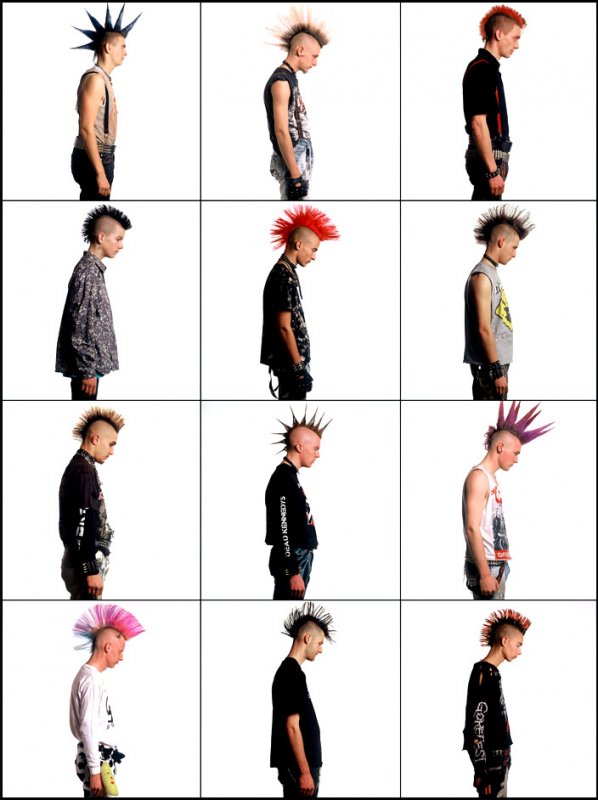
Third Response
Dyed Hair
For my third response I went to Camden and took pictures of people that I saw on the street that had dyed hair. I thought this was a good style to photograph as dyed hair is a good way to express certain personalities and I thought it was interesting seeing different people and their types of hair.


Typology continued


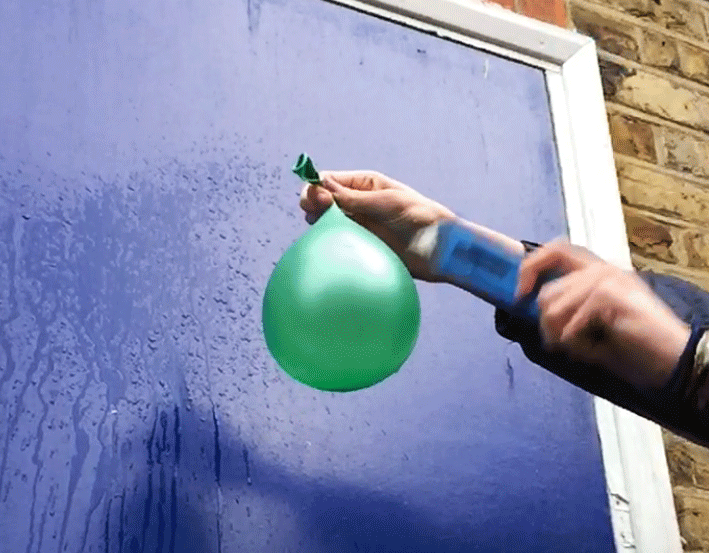
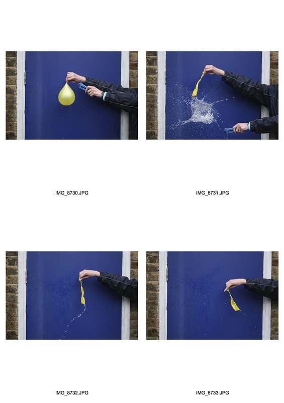
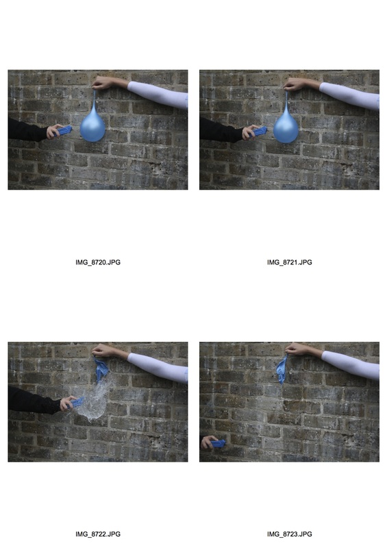
W A T E R B A L L O O N S
Below are videos taken in slo motion, gifs, images and screenshots of water balloons being popped. This shows disorder. I edited the images to make them stand out more. I used photoshop to increase the exposure and change the contrast.


|
|


|
|
3 Strands
1) Symmetrical Order
This strand is of symmetrical photos that are similar to the ones I took for my first response. The images below are sectioned into two categories, one is the original images before they were edited in Photoshop and the other is after. I did this to show the difference between the images that are edited and the ones that are not.
The original images |
Photoshopped images |


Chosen Images
I chose these images as I think they are the most interesting and visually pleasing from the selection above. I think the reflection method worked really well on these images as they are very gripping and fascinating.


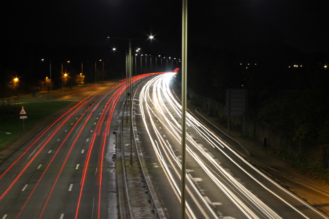
2) Light Disorder
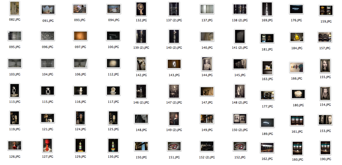
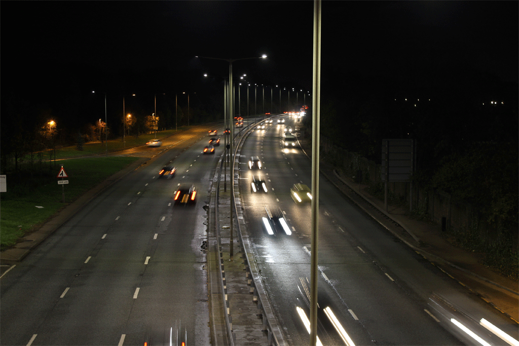
The contact sheet below includes 60 images that were taken at night in different places. The different places that I went to take these are south bank and North Finchley. I took these images using the bulb setting on my camera meaning there was a longer exposure which created a blurry light tracing the movement of the cars driving past. The 'best six' are my favorite images out of the 60 as they show good contrast and interesting colours.
Contact sheet
|
Selected images |


Edited images
The images below are edited. I edited them on Photoshop using the transformation feature. The images are symmetrical and show disorder in night life.


Gif Expressing Light Disorder
The image gallery bellow shows the images that I used to make the gif on the right. I made the gif using photoshop to create an animation that shows night disorder. I also reversed the frames so the gif flow smoother.
|
|
|


Further Light Disorder

|
|


Final piece


3) Typology Portraits


Edited Typology Portraits
I edited the images above and made them look like the images below. I did this using the 'mask' feature in photoshop. I made the image black and white and using the feature I made only the hair colourful. I did this to highlight and focus on the colour of the hair instead of the background or persons clothing etc. This is because the typology project is to show different personalities and styles and because I used hair to express that I decided to make everything but the hair black and white because that was the main focus of my project.


Selected Images
I selected these images because i think they express personality and style very well. The hair colours in the images below are very bright and interesting and the position the people in are and their facial expressions (which they chose as I didn't give them any instructions about what do to and where to look) gives the viewers and insight of the kind of people they are which is what I wanted to achieve from these images.


4) Portrait Disorder
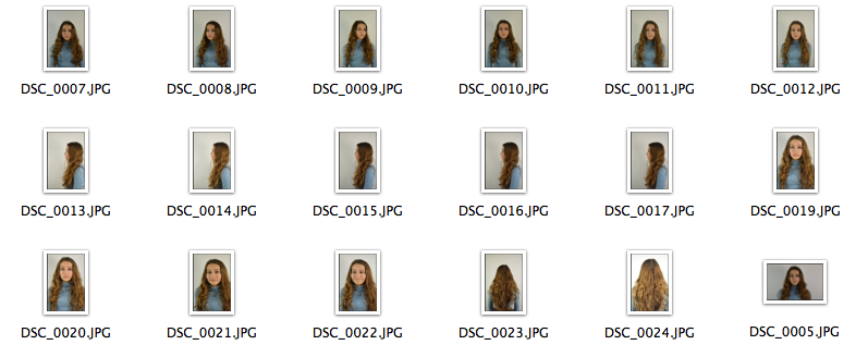
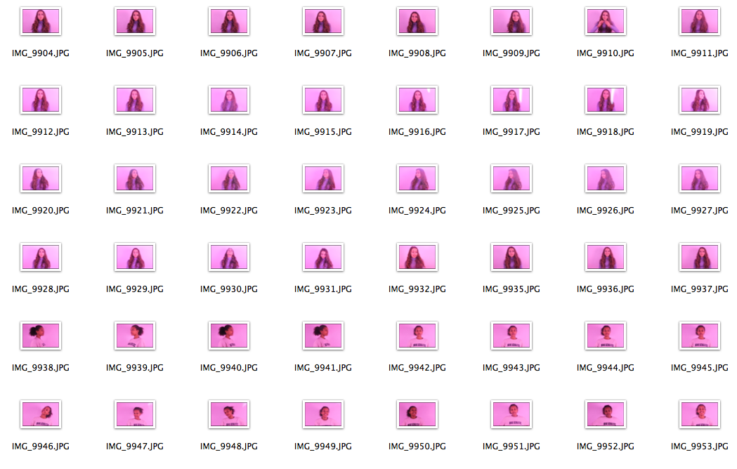
The contact sheet below is made of up 18 portraits that I took of a friend. I used a white background and studio lights to make these more professional and better quality as well as to show clearly what the main focus of each image is.
Chosen images


First development: Layering using opacity
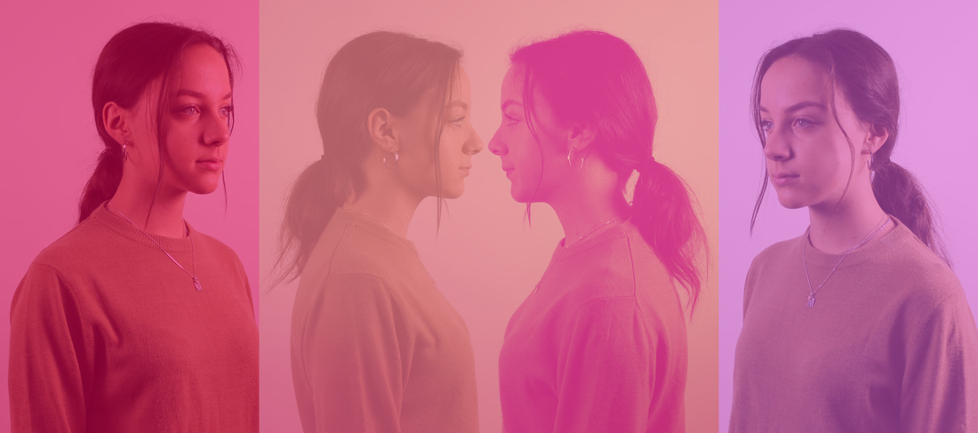
The images below are a compilation of the chosen images above. I edited them in photoshop by changing the opacity percentage. Once I lowered the opacity, I resized, transformed and positioned the images in ways that I found were interesting and intriguing.


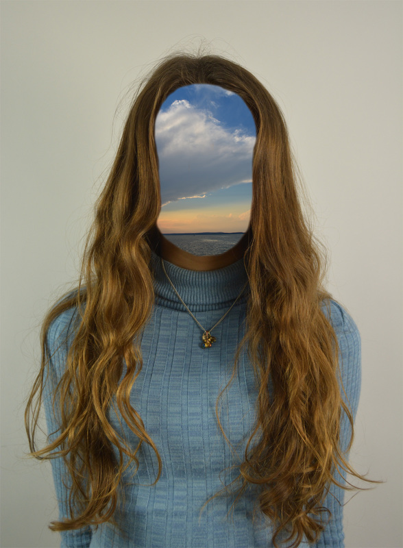
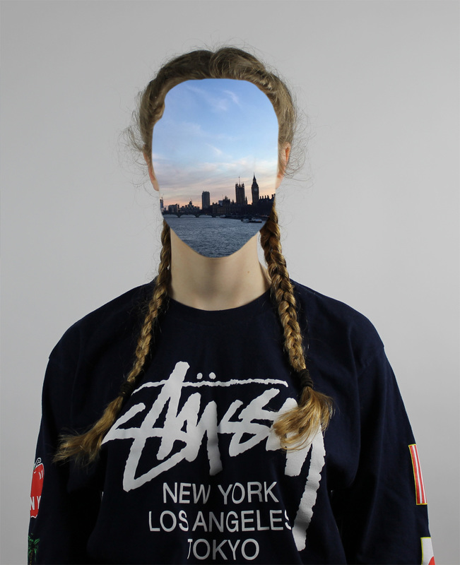
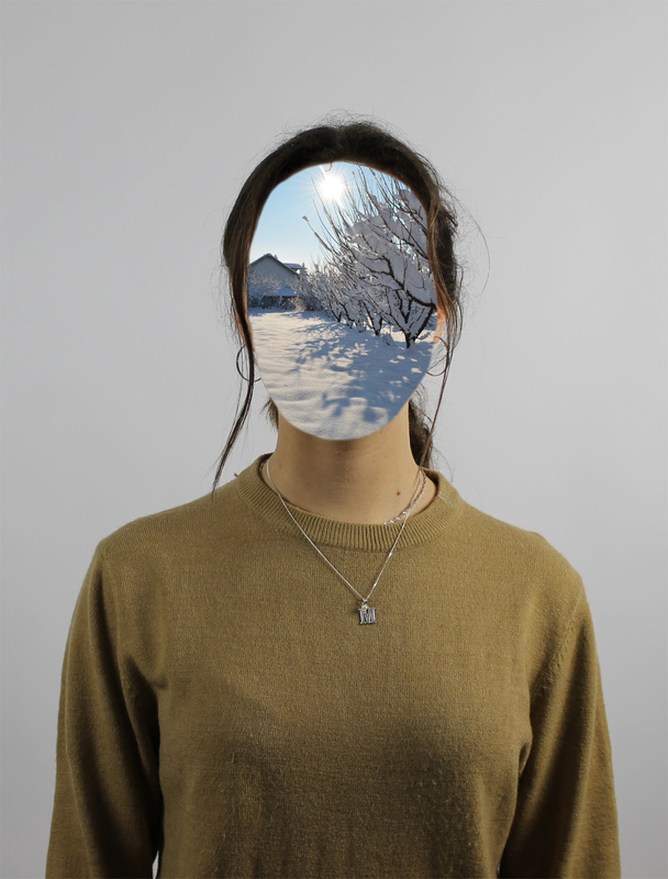
Second development: Double exposure images
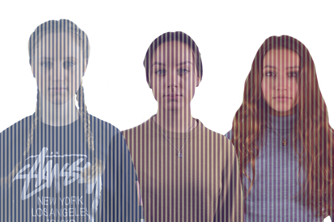
The images below are edited in photoshop. I used the double exposure idea to create them. I first took images of landscapes and clouds etc and pasted them on to the portrait image. I tried to choose the appropriate landscape images to make the image look more interesting and bright.

|

|

|


Developed portraits
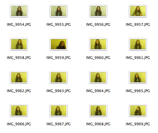
The contact sheets below are of images that I took of my friend. These images are different to the ones I first presented because I placed a colourful card in front of the lens to make the portraits colourful, interesting and bright.
|

|
Double exposure development
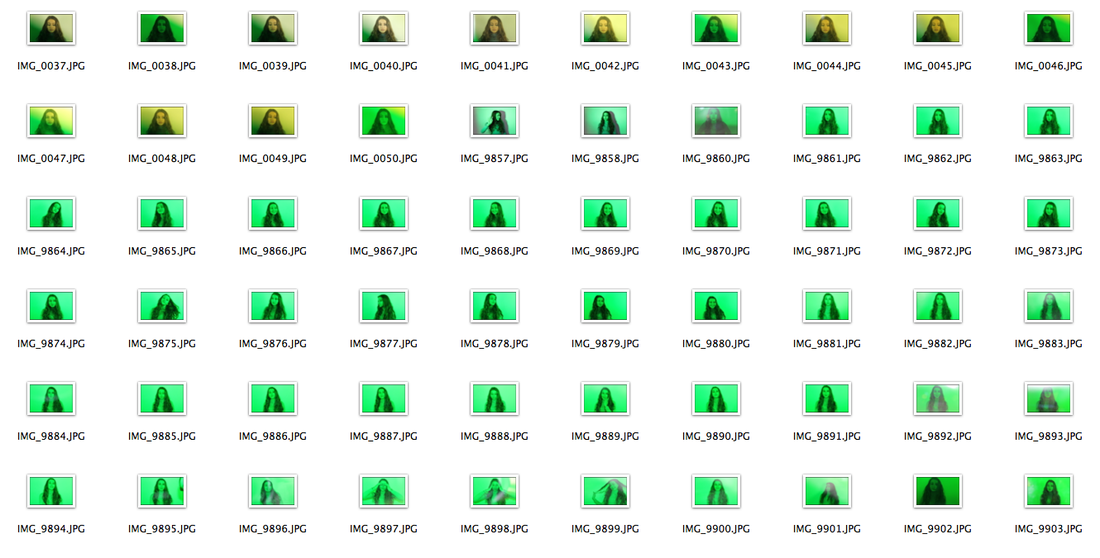
I created the images below using the same technique as the previous double exposure images. However I used different pictuires to create a more interesting efect. The green image below was taken witha green paper in front of the camera to create an eyecatching effect.

|

|
Third development


Fourth development


Fifth Development


6th development


Final Piece